
React has completely transformed the way we build modern web applications. With its powerful component-based architecture, developers now enjoy a more modular, reusable, and maintainable coding approach. But the real magic happens when you pair React with the right React UI component library.
Whether you’re building a dashboard, e-commerce site, or admin panel, using a well-crafted React JS UI library can save hours of work, enhance UI/UX consistency, and give your app a polished, professional feel — without reinventing the wheel.
In this ultimate guide for 2025, we’ve curated the best React UI libraries that developers swear by — from industry staples like Material UI and Chakra UI to emerging players offering lightweight, customizable solutions. We’ll compare their strengths, ideal use cases, and performance, so you can confidently choose the best ReactJS UI library for your next big project.
So if you’ve ever asked yourself:
- What is the best ReactJS component library in 2025?
- Which React UI libraries are trending now?
- How do I speed up development with a powerful React JS components library?
…then you’re in the right place. Let’s dive into the tools that make React development faster, cleaner, and a whole lot more fun!
Why Use a React UI Component Library?
A React UI library provides a collection of pre-built, customizable components for developers to quickly build their UIs. Rather than spending time creating UI elements from scratch, these libraries allow you to tap into high-quality, production-ready components.
Key Benefits of Using a React Component Library:
- Faster Development: No more reinventing the wheel. Use pre-built components for layouts, navigation, forms, and data display — cutting development time dramatically.
- Consistency: Ensure a unified look and feel throughout your application. Most React JS component libraries follow modern design systems (like Material Design), making your UI instantly professional and polished.
- Accessibility: Many popular ReactJS UI libraries (like Chakra UI or Radix UI) are built with accessibility in mind, helping you create inclusive interfaces that work for all users, without additional effort.
- Customizability: Whether you're building a startup MVP or a large-scale enterprise dashboard, the best React UI libraries offer flexible theming, component overrides, and style props — so your UI aligns perfectly with your brand.
- Scalability: As your app grows, using a standardized library keeps your codebase clean, modular, and easier to maintain. Many libraries even support tree-shaking and lazy loading to keep performance high.
By leveraging the right React UI component library, you can focus on what truly matters: building functional features and improving user experience.
Pro Tip: When you choose a React UI library that aligns with your project goals — like MUI for Material Design, or Tailwind + Headless UI for design freedom — you empower your team to build faster and smarter.
What to Look for in a React Component Library
Before you dive into selecting from the best React UI libraries in 2025, it's crucial to evaluate which one fits your project's goals, team workflow, and scalability needs.
With so many ReactJS UI libraries available, making the right choice can feel overwhelming. But don’t worry—we’ve narrowed down the key criteria you should keep in mind when choosing your ideal React library.
Key Factors to Consider:
1. Comprehensive Documentation
A great ReactJS component library should have well-structured documentation with clear usage examples, code snippets, and API references. This makes onboarding new developers easier and accelerates your development process.
Pro Tip: Always test the documentation first—if you struggle to find answers, your team likely will too.
2. High Customizability
Look for a React UI library that allows you to easily override styles, integrate with your branding, and support dark/light themes. Whether it's through CSS-in-JS, utility-first CSS, or theme tokens, customization is essential to building unique experiences.
3. Optimized Performance
Speed matters. Choose React JS UI libraries that are lightweight, support tree-shaking, and avoid unnecessary bloat. A snappy interface keeps users engaged and improves SEO and Core Web Vitals.
4. Strong Community & Maintenance
The best React JS component libraries have an active open-source community. Look for libraries with regular updates, GitHub stars, Stack Overflow discussions, and responsive maintainers. This ensures bug fixes, feature enhancements, and long-term reliability.
Now, let’s explore the best ReactJS UI libraries in 2025.
Best React UI Component Libraries in 2025
React’s component-based structure has transformed how developers build interfaces. But writing every UI element from scratch isn’t efficient. This is where React UI libraries come in. They provide pre-built, customizable components that speed up development while ensuring consistency and accessibility across your application.
Below is a curated list of the best React UI libraries developers are relying on in 2025. Each offers unique strengths, suited for different use cases.
1. Material UI (MUI)
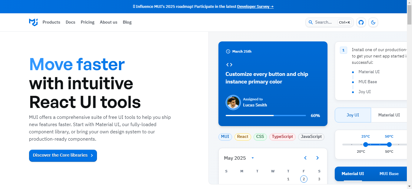
Material UI remains a go-to library for building elegant, functional interfaces. Based on Google’s Material Design system, it offers a vast range of responsive, production-ready components.
Why choose Material UI?
- A comprehensive collection of over 80 components, including buttons, tabs, sliders, and tables
- Deep theming capabilities for brand alignment
- WCAG-compliant accessibility features
- Seamless integration with TypeScript, Next.js, and other modern tools
Key Features:
- Layout components like Grid and Box for responsive design
- Components support dynamic styling via the sx prop
- Built-in support for right-to-left (RTL) layouts
- CSS-in-JS styling approach
- Rich documentation and active community
Best For: Enterprise apps, dashboards, and projects requiring a polished, material-inspired UI.
2. Chakra UI

Chakra UI focuses on simplicity and developer experience. It allows component styling through props, reducing the need for CSS and making development faster and more intuitive.
Why choose Chakra UI?
- Modular, composable components
- Built-in support for light and dark themes
- Accessible by default
- Easy customization using its theme object
Key Features:
- Responsive utilities using array and object syntax
- Support for style props (e.g., mt, px, color)
- Context-aware theming system
- Easy-to-integrate layout components like Stack, Flex, and Grid
- Accessible components like Modal, Tooltip, and Drawer
Best For: Apps needing fast styling, responsive design, and built-in accessibility.
3. Ant Design (AntD)

Ant Design offers a robust library of components tailored for enterprise-grade applications. It provides a polished UI experience with a consistent design system built for large-scale apps.
Why choose Ant Design?
- An extensive collection of components, including data tables, date pickers, and charts
- Internationalization and localization are built-in
- Professionally crafted design language
- Comprehensive documentation and enterprise adoption
Key Features:
- Form validation and dynamic field rendering
- Icon library and layout templates
- Grid system with 24-column layout
- Built-in theming and customization via Less
- A large ecosystem of additional tools and extensions
Best For: Enterprise software, internal dashboards, and large-scale apps.
4. Tailwind UI + Headless UI
 Tailwind UI, when paired with Headless UI, provides unstyled and fully accessible components. It’s perfect for teams that want complete control over UI design.
Why choose Tailwind UI?
- Unopinionated styling offers full visual freedom
- Headless UI provides accessibility logic for components
- Lightweight with no unnecessary styles or scripts
- Built for performance and modern workflows
Key Features:
- Built using Tailwind’s utility-first approach
- Headless components like Menu, Dialog, Switch, and Combobox
- Responsive and composable layout utilities
- Optimized for dark mode and custom themes
- Zero runtime CSS-in-JS, allowing faster loading
Best For: Developers and designers looking to build highly custom, performant interfaces with maximum flexibility.
5. React Bootstrap

React Bootstrap translates the classic Bootstrap framework into React’s component-driven model. It’s great for teams with experience in Bootstrap or those seeking a reliable, responsive UI foundation.
Why choose React Bootstrap?
- Bootstrap components rewritten using React
- Removes jQuery dependency
- Simple to learn and implement
- Mobile-first responsive design baked in
Key Features:
- Responsive grid system and utility classes
- Form components with validation support
- Consistent look-and-feel across platforms
- Integrates with existing Bootstrap themes
- Clean, familiar syntax for rapid development
Best For: Teams migrating from traditional Bootstrap or seeking stable, well-documented components.
6. ShadCN UI

ShadCN UI is a fast-growing library combining the best of Tailwind CSS and Radix UI. It offers minimalistic, performant components ideal for modern development needs.
Why choose ShadCN UI?
- Lightweight and clean design principles
- Accessible by default via Radix primitives
- Tailwind CSS-based for rapid customization
- Ideal for small bundles and fast apps
Key Features:
- Type-safe components with strong TypeScript support
- Focus on accessibility and composability
- Dark mode support out-of-the-box
- Minimal dependencies and code bloat
- Pre-configured templates and setup guides
Best For: Developers seeking a fast, minimalist, and highly accessible React UI toolkit.
7. BlueprintJS
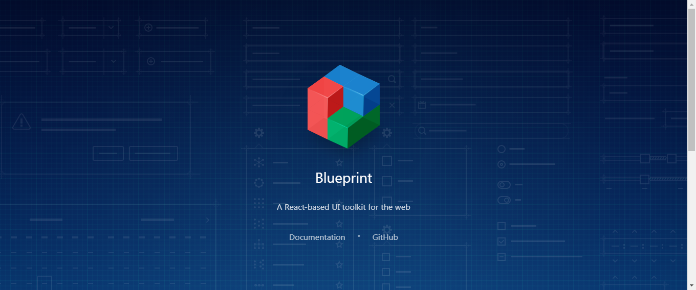
BlueprintJS is a comprehensive library designed for building complex, data-dense interfaces, especially suitable for enterprise-grade web apps and dashboards.
Why choose BlueprintJS?
- Specializes in complex, feature-rich components such as tables, date pickers, and tree views.
- Provides a consistent, modern design with a focus on high-performance UIs.
- Offers a wide variety of components to handle everything from modals to popovers.
Key Features:
- Responsive grid and layout components.
- Full suite of form elements like input groups, checkboxes, and radio buttons.
- Built-in accessibility and high contrast modes.
- Excellent documentation for large-scale app development.
- Styling via Sass with extensive theming and customization options.
Best For: Complex enterprise apps, large-scale dashboards, and applications requiring advanced UI components.
8. Semantic UI React

Semantic UI React is based on the popular Semantic UI framework but built specifically for React. It offers easy-to-use components that focus on consistency and semantic HTML.
Why choose Semantic UI React?
- Provides a large variety of high-level components such as buttons, tables, menus, and modals.
- Emphasizes a clean, natural language syntax for building UIs.
- Simplifies responsive design with its grid system and utility classes.
Key Features:
- Ready-to-use themes and styles based on a consistent design philosophy.
- Extensive support for forms and inputs, including validation and form-level feedback.
- High-level customization options with CSS variables.
- Built-in integration with React Router for seamless navigation handling.
Best For: Web applications that require a semantic, declarative design style and ease of use.
9. Evergreen

Evergreen is a React UI library built by Segment, focusing on design systems for enterprise applications. It combines simplicity with highly customizable components and offers a clean, modern aesthetic.
Why choose Evergreen?
- Comprehensive, production-ready components, especially suited for enterprise-grade web apps.
- Built to scale with large data sets and complex interfaces.
- Provides a consistent user interface that can be customized to match brand requirements.
Key Features:
- Includes core UI components like form controls, cards, date pickers, and tables.
- Customizable themes and easy-to-use layout components.
- Advanced modularity, allowing selective imports to minimize bundle size.
- Built-in support for modern workflows and integration with design systems.
Best For: Enterprise applications, internal tools, and platforms needing sophisticated components.
10. Grommet

Grommet is a React library built for accessibility, responsiveness, and performance. It is particularly useful for designing complex UIs for enterprise applications with heavy visual design requirements.
Why choose Grommet?
- Focuses on accessibility and responsiveness, offering high-contrast and screen reader-friendly components.
- Has a wide range of pre-built layouts and data visualization components.
- Easy to extend with custom themes to align with your brand.
Key Features:
- Comprehensive suite of components like charts, grids, forms, and overlays.
- Internationalization and localization built in.
- Advanced theming and visual configuration options.
- Fast, responsive design with minimal CSS overhead.
Best For: Data-heavy applications, dashboards, and tools where accessibility and responsiveness are top priorities.
11. React Suite

React Suite is an enterprise-oriented React UI component library that offers a rich collection of components optimized for complex business applications.
Why choose React Suite?
- Tailored for enterprise-level applications with sophisticated UI needs.
- Contains a variety of components, including tables, forms, sliders, and notifications.
- Offers a clean, modern design language with support for dark mode.
Key Features:
- Flexible and customizable components, including rich form controls, tables, and advanced layout grids.
- Offers a detailed and clear API for building custom components.
- Support for RTL (right-to-left) layouts and internationalization.
Best For: Enterprise applications, admin dashboards, and corporate websites.
12. UI Kitten
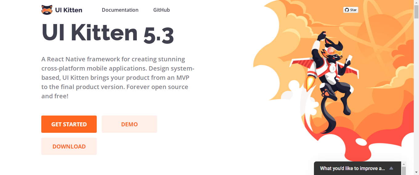
UI Kitten is a React Native component library that provides a set of high-quality, customizable components that are especially suited for mobile applications, offering a material-inspired design with customizable themes.
Why choose UI Kitten?
- Provides out-of-the-box mobile components with a Material Design feel.
- Great for building React Native mobile applications.
- Offers both light and dark themes with a high level of customizability.
Key Features:
- Pre-built UI components for mobile apps, including inputs, cards, navigation, and overlays.
- Customizable themes that allow you to tailor the design to your brand.
- Simple integration with React Native for building apps across platforms.
Best For: Mobile applications, especially those built with React Native.
13. React Toolbox

React Toolbox is a library that provides high-quality material design components built with React, using CSS Modules. It is focused on providing developers with a simple, scalable, and consistent interface.
Why choose React Toolbox?
- Implements Material Design specs using simple, flexible React components.
- Includes CSS Modules for easy customization without overriding styles.
- Clean and simple interface with minimal configuration.
Key Features:
- Modular components include buttons, date pickers, sliders, and input fields.
- Full customization using CSS Modules for seamless theming.
- Minimal setup required with a focus on ease of use.
Best For: Projects requiring a clean, minimal design with Material Design standards.
14. Rebass

Rebass is a lightweight, responsive, and themeable UI component library built with Styled System. It is highly customizable and great for developers who prefer a minimal, functional design.
Why choose Rebass?
- Lightweight with a focus on flexibility and customization.
- Built using Styled System, allowing developers to easily handle responsive layouts and component spacing.
Key Features:
- A small collection of components, including buttons, cards, and modals.
- Themeable with the Styled System API, making it highly customizable.
- Optimized for performance with a minimal footprint.
Best For: Small projects, MVPs, and apps requiring responsive, minimalistic design.
Key Trends for React UI Libraries in 2025
As the React ecosystem evolves, UI libraries are becoming more sophisticated to meet modern development demands. In 2025, the trends shaping React UI libraries reflect the growing need for performance, customization, accessibility, and developer experience. Here's a look at the key trends driving the development of React UI libraries:
1. Increased Focus on Accessibility by Default
- Why it matters: With growing awareness around web accessibility, UI libraries are making accessibility a priority by including accessible components right out of the box. This ensures developers don’t have to build accessibility features from scratch, speeding up development while ensuring inclusivity.
- Examples: Libraries like Chakra UI, ShadCN UI, and Headless UI are designed with accessibility in mind, offering components that follow WCAG guidelines, including keyboard navigation, screen reader support, and focus management.
- Trend: Expect to see more UI libraries focusing on making components accessible by default, rather than leaving it up to developers.
2. Tailwind Integration and Utility-First Design
- Why it matters: Tailwind CSS continues to gain popularity due to its utility-first approach, which allows developers to rapidly prototype and build custom UIs. React UI libraries are increasingly integrating Tailwind CSS into their workflows to give developers flexibility without sacrificing performance or ease of use.
- Examples: ShadCN UI, Tailwind UI, and other libraries that provide minimalistic, unstyled components compatible with Tailwind's utility-first approach.
- Trend: Expect more UI libraries to either natively support or integrate easily with Tailwind CSS, allowing for quicker customizations and reducing the need for complex CSS overrides.
3. Component-Based Customization with Minimal Overhead
- Why it matters: Developers are demanding more control over individual components without the overhead of unnecessary styling or scripts. Libraries are moving toward modular, composable components that allow for easy customization while keeping the bundle size small.
- Examples: Headless UI and ShadCN UI provide fully unstyled, composable components that focus on accessibility and performance, enabling developers to add custom styles with minimal bloat.
- Trend: Expect libraries to offer more headless or low-level components, giving developers complete control over the design while maintaining flexibility and performance.
4. TypeScript Support and Type Safety
- Why it matters: TypeScript has become the standard for building scalable React applications due to its ability to provide type safety and improve developer productivity. React UI libraries are increasingly offering first-class TypeScript support, including type-safe components and hooks.
- Examples: Libraries like MUI, Chakra UI, and ShadCN UI have embraced TypeScript, allowing developers to write more reliable code and catch potential issues early in development.
- Trend: Expect even more libraries to offer TypeScript-first approaches, reducing bugs and improving the developer experience.
5. Improved Performance and Optimization
- Why it matters: Performance is always a top priority for web developers, and UI libraries are continuing to evolve with a focus on minimizing bundle sizes and improving load times. In 2025, libraries will focus on faster rendering, fewer dependencies, and better tree-shaking.
- Examples: Libraries like React Bootstrap and ShadCN UI are already optimized for speed, with minimal dependencies and support for tree-shaking to ensure that only the necessary code is included in production builds.
- Trend: Libraries will continue to prioritize performance optimizations, with lightweight components and minimal overhead to ensure faster load times and smoother user experiences.
6. Design Systems and Brand Consistency
- Why it matters: Many businesses need to create apps that align with their brand identity while maintaining a consistent look and feel across different platforms. React UI libraries are increasingly offering robust theming and customization features to help maintain brand consistency.
- Examples: Material UI and Ant Design (AntD) provide deep theming capabilities that allow developers to match the components to their brand’s color scheme, typography, and spacing.
- Trend: Libraries will continue to evolve with more powerful theming systems, enabling developers to build highly branded, consistent UIs without needing to override every component manually.
7. Cross-Platform and Mobile-First Components
- Why it matters: As the demand for responsive and mobile-first designs continues to grow, React UI libraries are placing greater emphasis on components that are optimized for mobile devices.
- Examples: React Bootstrap and Chakra UI offer mobile-first grid systems, responsive design utilities, and components that adapt seamlessly to different screen sizes.
- Trend: Expect more libraries to focus on mobile-first approaches, with out-of-the-box responsiveness and components designed to work across web, tablet, and mobile devices.
8. Simplified State Management with Built-In Hooks
- Why it matters: Managing state in React can sometimes be complex, but UI libraries are beginning to integrate simple state management solutions directly into their components. This enables smoother interactions and eliminates the need for third-party state management libraries for common use cases.
- Examples: Chakra UI and MUI provide hooks for handling component-level state (e.g., modals, accordions, and dropdowns) without needing to rely on external state management tools.
- Trend: UI libraries will increasingly include built-in hooks and state management for common component states, reducing the need for developers to integrate additional libraries.
9. Dark Mode and Customizable Themes
- Why it matters: Dark mode continues to be a popular UI trend. React UI libraries are increasingly providing built-in support for dark mode and offering more advanced theming systems to support a range of visual styles and preferences.
- Examples: Chakra UI and Tailwind UI offer easy-to-implement dark mode and light mode, with customizable themes that allow for seamless transitions between different visual modes.
- Trend: Expect more UI libraries to offer comprehensive dark mode support and highly customizable theme configurations, allowing developers to create apps that cater to user preferences.
10. AI-Driven UI Components
- Why it matters: As AI and machine learning technologies continue to evolve, UI libraries are starting to integrate AI-driven features that can dynamically adjust layouts, recommend UI adjustments, and automate design tasks based on user interactions or preferences.
- Examples: This trend is still in its early stages, but libraries like Tailwind UI may eventually incorporate AI tools for layout adjustments, responsiveness optimization, and user behavior-driven design changes.
- Trend: Over the next few years, expect more UI libraries to incorporate AI or machine learning-driven functionalities that automate and optimize UI design decisions.
When to Build Your Own React Component Library
Sometimes, using a ReactJS UI library isn’t enough. If you’re developing a large-scale application with unique design requirements, you might consider creating your own React component library. This allows you to build reusable components that follow your custom design system and business logic.
Using platforms like FAB Builder, you can efficiently create and manage your own React JS components library, ensuring that your team can scale and maintain the project easily.
How to Choose the Right React UI Library in 2025
When choosing a React UI library, it's important to consider the specific needs of your project. Here are some questions to ask yourself that will help you determine the best fit:
1. Do you need opinionated designs (MUI, AntD) or full design freedom (Tailwind UI, ShadCN)?
Opinionated designs provide a consistent and ready-to-use design system, often inspired by Material Design (like MUI) or enterprise-focused systems (like AntD). These are best for developers who want polished, professional UIs without spending too much time on design choices.
Best for: Teams needing quick, consistent UIs with minimal customization required.
Full design freedom offers flexibility, allowing you to build your design system from scratch. With libraries like Tailwind UI (paired with Headless UI) or ShadCN, you can start with unstyled components and add your own visual design.
Best for: Teams or developers who want complete control over the design without being constrained by predefined styles.
2. Is accessibility a priority (Chakra UI, ShadCN)?
Accessibility is essential for creating inclusive applications. If your project demands high accessibility standards, Chakra UI and ShadCN are excellent choices, as both libraries are designed with accessibility in mind by default.
Best for: Projects that need to ensure a wide range of users, including those with disabilities, can easily interact with your app.
3. Are you building a dashboard-heavy UI (AntD, BlueprintJS)?
Dashboard-heavy UIs typically require complex components like data grids, tables, charts, and forms. Libraries like Ant Design (AntD) and BlueprintJS offer robust components specifically designed for enterprise applications and data-intensive dashboards.
Best for: Building enterprise-grade applications or dashboard-focused platforms that rely heavily on data visualization and user interaction.
4. Do you want to scale your component system in-house (FAB Builder)?
If you plan to create a custom component system that aligns perfectly with your brand or business requirements, you might want to consider FAB Builder. This platform allows you to build your own component library while offering flexibility in scaling and adding functionality.
Best for: Projects where long-term flexibility, customizability, and scalability are critical, especially if you plan to maintain or grow the UI components internally.
5. What is your project's complexity and performance requirements?
For simple projects or MVPs, lightweight libraries like Rebass or Tailwind UI may be the best option, as they are fast and easy to integrate.
For complex projects with high-performance demands, ShadCN UI or Grommet offer minimal dependencies and optimized components that cater to performance-driven applications.
Best for: Lightweight, performance-oriented applications versus data-heavy, enterprise-grade solutions.
6. How important is internationalization (AntD, Grommet)?
If your application needs to support multiple languages or regions, Ant Design (AntD) and Grommet have built-in internationalization (i18n) and localization (l10n) support, making it easy to adapt your UI to different cultures.
Best for: Applications targeting global markets or diverse user bases.
7. How much customization do you need?
MUI, AntD, and BlueprintJS provide a wide range of pre-built, customizable components that can be tailored to fit your needs. However, Tailwind UI and ShadCN give you more flexibility for deep customization at the component level, allowing you to build the design from scratch.
Best for: If you need fine-tuned control over the look and feel, consider more customizable libraries like Tailwind UI or ShadCN.
FAB Builder and React UI Libraries
FAB Builder is empowering developers by integrating with leading React UI libraries to create flexible, high-performance UIs. Whether you're building dashboards, enterprise apps, or custom components, FAB Builder enhances development workflows, ensuring fast, scalable, and consistent results.
What is FAB Builder?
FAB Builder is a cutting-edge, low-code platform that simplifies web and mobile application development. It offers an intuitive interface for building fully functional apps without extensive coding.
FAB Builder's UI Features in the React Ecosystem
1. Seamless Integration with React UI Libraries
FAB Builder offers easy integration with popular React UI libraries like Material UI (MUI), Chakra UI, Ant Design, and more. This allows developers to incorporate pre-built, customizable components into their projects, speeding up the development process without sacrificing design quality.
Why it matters: By leveraging these libraries, developers can avoid reinventing the wheel. Instead, they can focus on customizing components to meet specific needs, ensuring both design consistency and development efficiency.
2. Design System Compatibility
FAB Builder is designed to seamlessly work with your existing design system. Whether you're using MUI, Chakra UI, or Tailwind UI, FAB Builder allows you to integrate these components into your design system without disruption. This ensures your UI remains consistent, visually appealing, and aligned with your brand guidelines.
Why it matters: By using FAB Builder alongside your design system, you ensure uniformity across all components, reducing design inconsistency and enhancing the user experience across different pages and platforms.
3. Automatic Performance Optimization
FAB Builder automates key performance optimizations, such as lazy loading and code splitting, which are critical for high-performance applications. These optimizations are automatically implemented when using React UI libraries, ensuring your app is fast and responsive.
Why it matters: Developers can focus on building app features instead of manually handling performance tweaks, resulting in a faster, more efficient development cycle. Performance optimization becomes part of the standard development process.
4. Customizable Components and Widgets
With FAB Builder, developers can easily customize components and widgets from popular React UI libraries like Material UI and Chakra UI to suit specific business needs.
Why it matters: The ability to customize components directly in FAB Builder ensures that developers can create unique UIs tailored to their brand without starting from scratch. Customization becomes a smooth, straightforward process.
5. Integrated Back-End Services
FAB Builder also simplifies the integration of back-end services with front-end UI components. Whether you're building a custom dashboard or an enterprise-level app, FAB Builder supports API integrations that can be tied to the React components, reducing the need for separate back-end development.
Why it matters: By integrating back-end services with React UI libraries through FAB Builder, developers can build end-to-end applications that are feature-rich and easy to maintain.
6. Cross-Platform Development
FAB Builder ensures that components built with React UI libraries are responsive and adaptable across different devices, including mobile, tablet, and desktop. This feature enables the creation of cross-platform applications, expanding the reach of your web app without extra coding.
Why it matters: Cross-platform compatibility is essential for reaching a wider audience, and FAB Builder ensures your React components work seamlessly across all devices, eliminating the need for separate codebases for different platforms.
Conclusion
Choosing the right React UI library can dramatically improve your development speed, UI consistency, and overall user experience. Libraries like MUI, Chakra UI, and AntD have earned their place as the go-to solutions for building responsive and accessible web apps in 2025.
When selecting a ReactJS UI library, consider your project’s unique needs—whether it’s a sleek modern UI with Chakra UI, an enterprise solution with AntD, or a fully customized design with Tailwind UI.
Integrating React UI libraries with FAB Builder has never been easier! Streamline your workflow, enhance UI consistency, and optimize performance—whether you're building a simple app or a complex enterprise solution. Start building faster, smarter, and more efficiently today!
Frequently Asked Questions
What is the purpose of a React UI component library?
React UI libraries provide pre-built, customizable components (like buttons, modals, and tables) to accelerate development, ensure consistency, and improve accessibility across web applications.
Can I use multiple React UI libraries in the same project?
Yes, but it's not recommended unless necessary. Mixing libraries can increase bundle size and lead to inconsistent design patterns. Choose one that aligns best with your project goals.
How does FAB Builder support React UI libraries?
FAB Builder allows you to import and customize components from popular React UI libraries. It supports theming, layout tools, and design systems, making it easier to build and scale frontends rapidly using your preferred UI kit.
Which React UI library is best for enterprise apps?
Libraries like Ant Design (AntD) and MUI are ideal for enterprise apps due to their mature component sets, accessibility features, and internationalization support.
Can I use FAB Builder to build dashboards or admin panels?
Absolutely. FAB Builder supports complex UI structures like dashboards, tables, graphs, and multi-step forms. It’s ideal for use cases like CRM, admin panels, ERP interfaces, and internal tools.
What level of developer experience is needed to use FAB Builder?
Beginner to advanced. Non-devs can build using the visual interface, while developers can dive deeper with code, API integrations, and component logic. FAB Builder suits mixed-skill teams.
